This stirring ad from Bell’s Whisky has been making waves in marcomm circles for all the right reasons. What struck me was the simplicity of the video’s execution; while many other ads offer thematic imagery of luxury, sex appeal, and rugged adventure, “The Reader” opts for a different route. We don’t see frantic car chases, complex set pieces, or a handsome protagonist seducing a room full of supermodels. We don’t see pyrotechnics, shootouts, or exotic animals. Instead, we see beautiful storytelling in the form of a classic struggle where an indomitable “everyman” triumphs after a lengthy struggle.
This narrative arch isn’t new but “The Reader” realizes this concept to perfection. Why? What makes this video connect?
Inspired Writing
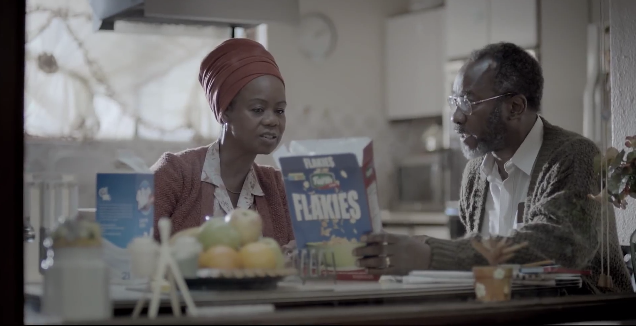
High-end whiskey ads employ hyper-idealized avatars of each brand’s target demographics. The people depicted are usually young, beautiful, somewhat affluent, and looking to fulfill a momentary pleasure (re: getting lucky that night). They travel in luxurious surroundings with breathtaking architecture and stylish sports cars. These characters are alpha thrill-seekers, ambitious and they demand your attention.
“The Reader” establishes its own identity by centering its storytelling on a premise that includes some unorthodox (for whiskey commercials) characteristics:
- An elderly protagonist
- A ho-hum, middle-class life
- An “unsexy” social issue (adult literacy)
Yet, this video completely works. The narrative, identifiable and empathetic, is grounded in realism. The creators know when to employ just the right amount of humor – balancing poignant (the protagonist running into trouble for using a ‘k’ for “cat” in Scrabble) and playful (spelling “hello sexy” with alphabet soup).

We see a gradual accumulation of small victories for our hero. His triumph at the end feels authentic and organic as we see his progress in equal parts success and stumble. In other words, there is real conflict and adversity on the way to reaching a goal.
A Soundtrack That Fits
The backing track starts slowly with a plaintive string section. Rather than dwell in a mournful pity, the tempo picks up during the montage of our hero taking his first steps so to speak. New instruments are introduced as our protagonist learns more words and gains a greater confidence in his abilities.
In a tasteful choice, the creators tone down the music when the story reaches its climactic twist, allowing the deft acting and strong emotional impact to resonate. The music swells again after the embrace between father and son and takes us to the closing tagline. Here, the soundtrack acts as a supplement to what is visually told instead of overpowering our senses. Great video storytelling is not only about mastering sight and sound but understanding when certain elements lead and when certain elements support.
Establishing a Rhythm Through Cinematography and Editing
A lot of the stylistic choices in “The Reader” are quiet. The color palette is muted with emphasis on slightly unsaturated greys, browns, and earthy tones. This tactic allows our attention to be drawn to alerting reds, yellows, and oranges that begin to appear in the middle of the video.
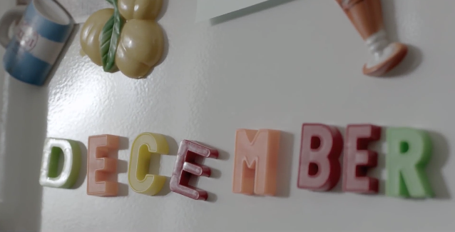
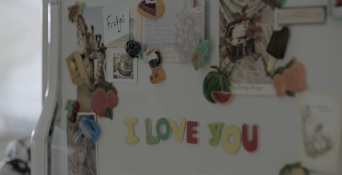
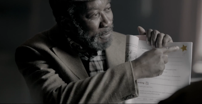
I was especially taken by the subtle use of the color yellow. In most scenes, yellow hues are washed out or dulled to an off-yellow variation. That unmistakable vibrancy is restrained. However, “The Reader” employs color consistency to build up to a visual crescendo in the final frame. At first, we see muted yellow tones (in the form of a Post-It note or comic books) associated with elementary beginnings. Soon, greater vibrancy is introduced as our hero begins spelling words on the refrigerator. A major heartwarming point reveals the protagonist proudly pointing to a gold star.


Finally, the creators contrast Bell’s Whisky golden amber tones in a shallow depth of field with an obscured the greyscale background. Though a bit heavy-handed, we see Bell’s Whisky as the gold star personified.
A “Twist” Ending That Packs an Emotional Punch
Above all else, “The Reader” works as a story. The major conflict (re: ups and downs our protagonist experiences) is believable – and while admirable – deceptively ordinary on the surface. That is…until we see the big reveal. While many traditional storytelling approaches establish character motivations up front, some of the best creations reveal layers of complexity that make us reconsider our own perspectives and prejudices. This “twist” serves to amplify the emotional resonance of the protagonist’s journey while enriching his character.
Humanity First, Branding Second
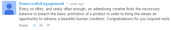
“The Reader” is a perfect example of branded content treating audiences with respect. The storytelling does not appeal to the lowest common denominator and holds a certain quality of grace as the plot unfolds. The video delicately addresses a troubling social issue with dignity, humility, humor, and heart. The result exemplifies what YouTube user “DemocraticEngagement” rightly pinpoints as a “beautiful human condition.” Here, we as audiences and consumers experience the opportunity for brands to break through prevailing cynicism and jaded snark to reflect on a small testimony of what makes us human.
The video, currently over 1.2 million views on YouTube, was a collaboration between King James, a Cape Town, South Africa ad agency and Velocity Films.
Director: Greg Gray, Velocity Films
Production House TV Producer: Helena Woodfine
Group Chief Creative: Alistair King
Executive Creative Directors, King James: Devin Kennedy / Matt Ross
Creative Director, King James: Mike Wilson
Art Director, King James: Cameron Watson
Agency TV Producer: Caz Friedman
Client Service: Sheri Cook


Pingback: 6 Ways to Get More Out of Your Smart Phone Video Production